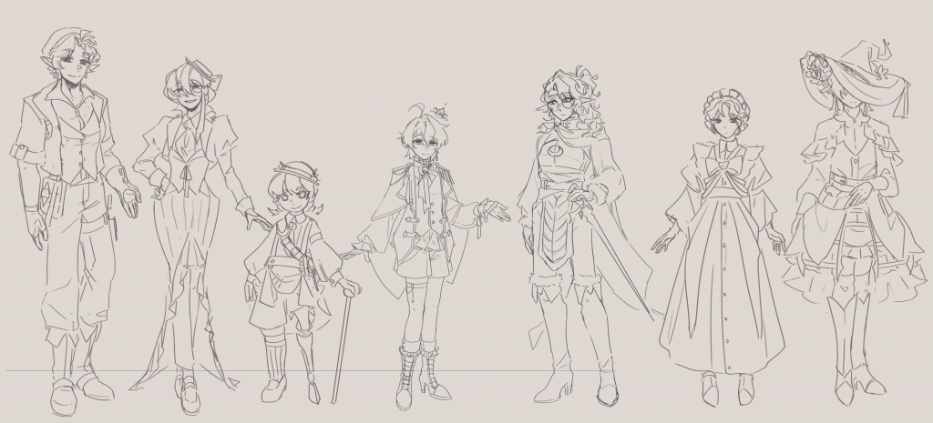
While I was designing NPC concepts and enemies, I passed the work of designing the two main characters, Stellio and Ictus, onto Viridian. It may seem like a silly thing to do considering the importance of the role, but I swear I have my reasonings!
When Lumiron was first created, it was a world to put our self insert OCs into, something teenagers did online for fun. Shion (Stellio) was Shuli’s self insert, whereas Hero (Ictus) is Viridian’s. Mine are irrelevant at the moment….
Because Shuli is more or less absent from the project now, this leaves Viri and I being the original creators of the world. I gave Viri the role of reimagining the characters into the current narrative, because I know that they were very important to him.
Viri has done good work so far, but everything is a little disjointed. Plus with the addition of his own school taking priority, I took over and finished designing Stellio based on his concept sketches.
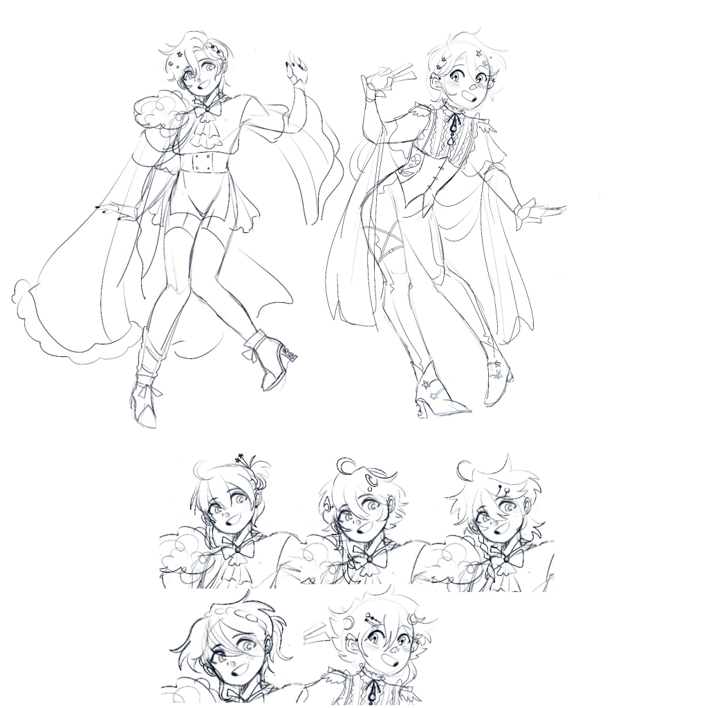
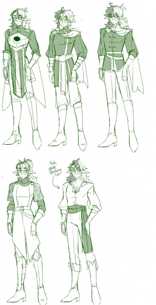
Above: Viri’s concept sketches for Stellio
Stellio is the main character of the story, so having his design lagging behind like this will hinder progress with the rest of the game. From here, I took over the design process and attempted to give Stellio a final design so we could begin asset creation for him.
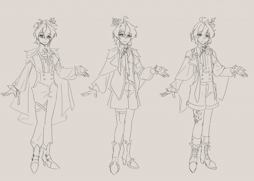
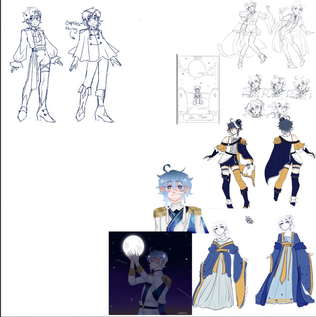
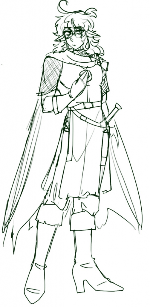
left: Viri’s Stellio design; mid/right: iterations on the design
Stellio’s fashion is based on the modern Ouji Lolita fashion, a style that combines Victorian elements with cuteness of Lolita fashion with a princely twist (Ouji means “prince” in Japanese). While I liked Viri’s Stellio design, I found the fashion choice to be slightly too mature for him. Instead, I opted for shorts and a cloak instead of a full cape to symbolize youth and inexperience. I kept the idea of the floating crown as it looked quite whimsical and appealed to my tastes.
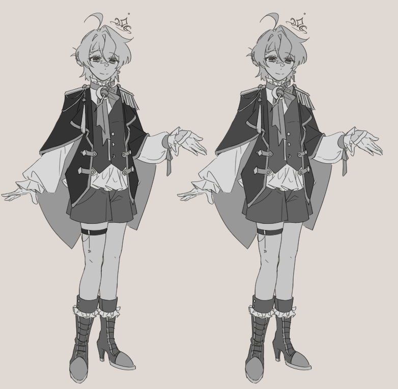
Final linework for Stellio + Colors (right is final)
I think my interpretation of Stellio differs from Viri’s. He seems more lively and innocent in Viri’s work, whereas I depict him as gentle with a more tired smile. I like to view him as someone who , while not equipped to handle the responsibilities pushed onto him, will still try his best to right anything that has been wronged (even to his own detriment).
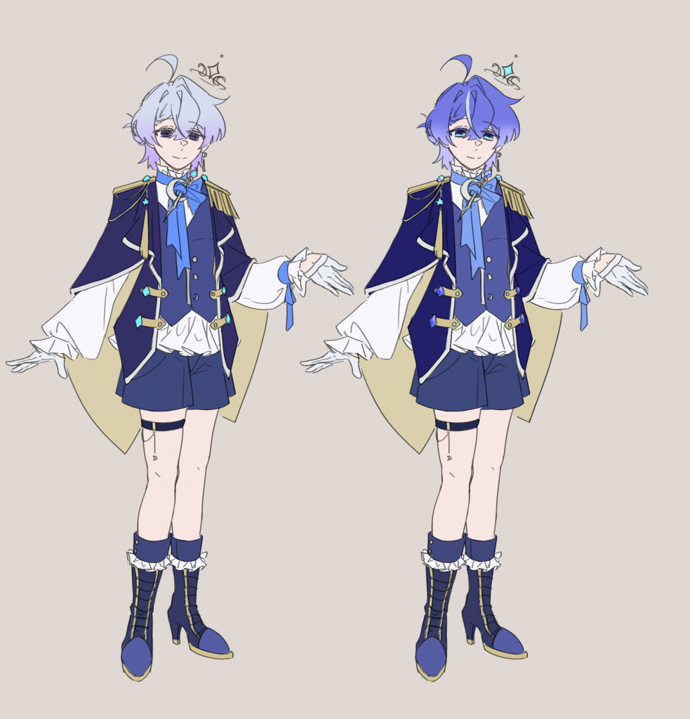
Stellio’s color palette is straightforward. He is the prince of Lumiron and a child of the moon, so blue is featured primarily in his color palette. I also chose to make him brighter than his surrounding grounds and flora to signal him as a source of life/mana in the world, whereas the rest of Lumiron is paler and less saturated.
Ictus was mostly designed by Viri, as the origins of this character is important to him. Due to this, I felt as though Ictus’ style and design philosophy differs slightly from the rest of the cast, which I tried to mitigate by editing him slightly.
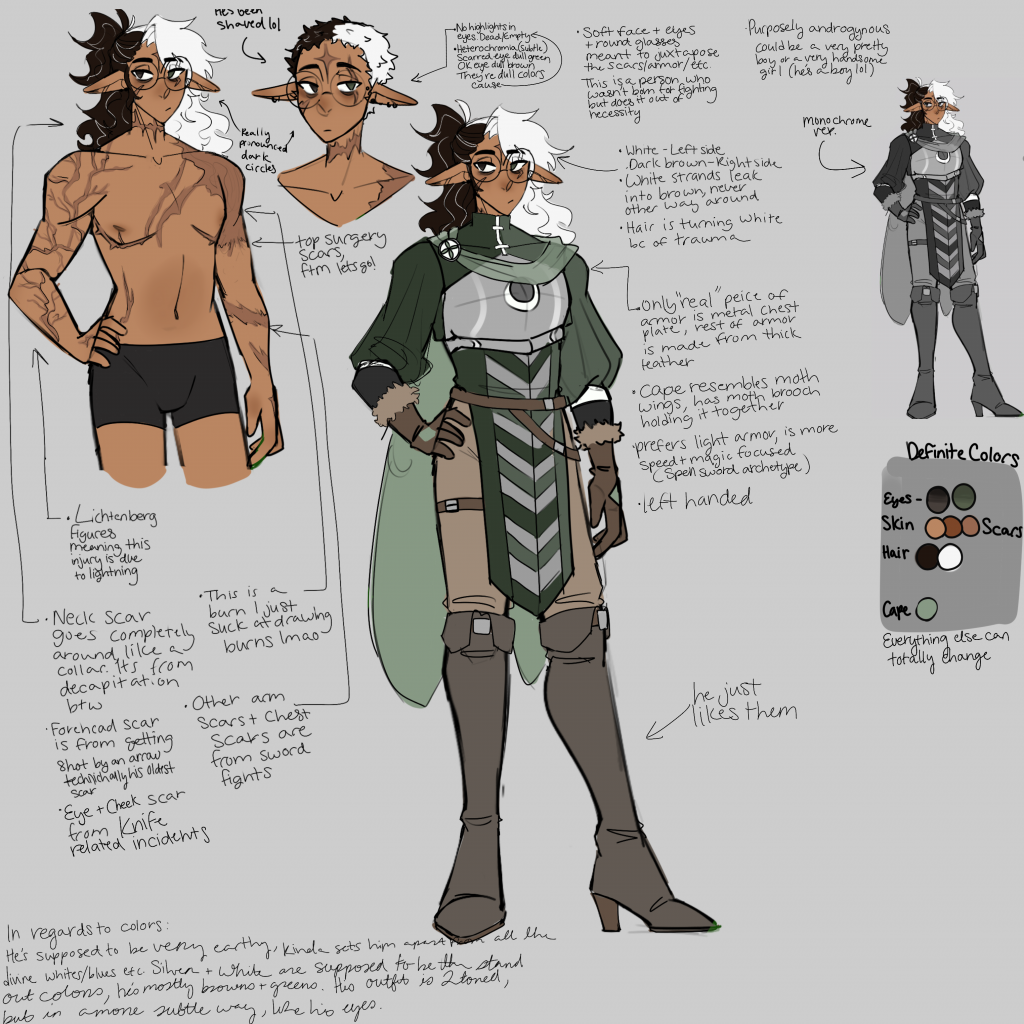
Viridian had a lot to say about Ictus lol
Due to previously being an established character, nailing Ictus’ desisgn while still trying to keep the original vibe of him became a big challenge throughout the process. He appears much more muddy and dark compared to Stellio and the world around them, which could be explained away with his backstory of coming from a different planet… But I still thought there was room for improvement.
Ictus after I edited him
Ictus is based on a Lunar moth, which I thought was not represented well in the design that Viri submitted to me. To fix this, I gave him fluffier hair to emulate the moth’s neck fluff as well as added more fuzzy parts to his design. I also introduced a pinkih maroon to his color palette, reminiscent of the Lunar moth’s bright pink limbs in a more subtle manner. some tweaks to his cape and belt were done to make the overall design look more cohesive.
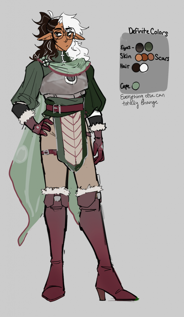
I drew Ictus in my style and put him alongside the rest of the cast. It seems like he belongs here more, right?
Overall, I believe it would have been more beneficial time wise if I had been in charge of designing all the characters… But then I wouldn’t be able to find anything for Viri to do. Plus the exercise of trying to integrate Ictus into the cast was very interesting– It made me think about exactly why our designs looked so different and what had to change for them to be cohesive together.
Leave a Reply